

韓国ドラマ『魔女のゲーム』にでているキャストや相関図のご紹介★
魔女のゲーム登場人物の名前など気になったりすることもあるかと思います
どんなキャストが出ているのか、相関図、ストーリーなどご紹介していきます!
- 韓国ドラマ 魔女のゲームのご紹介★
- 魔女のゲーム キャスト
- [jin_icon_heart size=”25px” color=”#ffc0cb”]<役名>ソル・ユギョン(俳優名)チャン・ソヒ
- [jin_icon_heart size=”25px” color=”#ffc0cb”]<役名>チョン・ヘス/チョン・ミソ(俳優名)キム・ギュソン
- [jin_icon_heart size=”25px” color=”#ffc0cb”]<役名>カン・ジホ(俳優名)オ・チャンソク
- [jin_icon_heart size=”25px” color=”#ffc0cb”]<役名>ュ・セヨン/チャ・カンジュ(俳優名)ハン・ジワン
- [jin_icon_heart size=”25px” color=”#ffc0cb”]<役名>マ・ヒョンドク(俳優名)パン・ヒョジョン
- [jin_icon_heart size=”25px” color=”#ffc0cb”]<役名>ユ・インハ(俳優名)イ・ヒョンソク
- [jin_icon_heart size=”25px” color=”#ffc0cb”]<役名>チュ・ボムソク(俳優名)ソヌ・ジェドク
- [jin_icon_heart size=”25px” color=”#ffc0cb”]<役名>(俳優名)
- [jin_icon_heart size=”25px” color=”#ffc0cb”]<役名>アン・ヒヨン(俳優名)チュ・セビョク
- [jin_icon_heart size=”25px” color=”#ffc0cb”]<役名>コ・ソンジェ(俳優名)キム・シホン
- [jin_icon_heart size=”25px” color=”#ffc0cb”]<役名>チン・ソンミ(俳優名)ヤン・ジウォン
- その他のキャスト
韓国ドラマ 魔女のゲームのご紹介★

[jin_icon_video size=”25px” color=”#ffc0cb”]魔女のゲーム 予告動画
[jin_icon_movie size=”25px” color=”#ffc0cb”]魔女のゲーム 放送予定
KNTV
3月12日(日)21:20
本放送
4月26日(水)20:00
[jin_icon_bookopen size=”25px” color=”#ffc0cb”]魔女のゲーム あらすじ
天下のチョナグループに勤めるユギョン(チャン・ソヒ)は会長のヒョンドク(パン・ヒョジョン)の家で過ごしていると、突然爆発が起こり愛娘のミソを目の前で失う。
悲しみに暮れるユギョンだったが、実は一連の事件は母娘を引き離すためのヒョンドクの差し金によるものだった。
8年後、「あなたの娘は生きています」という手紙が届き、ユギョンは驚きを隠せないでいた。
検事のボムソクと再婚し、養護施設で出会ったヘスが愛娘のミソと重なりDNA検査を内密に行っていた。
ユギョンがミソを探しているという事実がヒョンドクに伝わり、”実の親子である検査結果”を、同じ養護施設のガンジュとすり替えたのだった。
娘がヘスではなくガンジュだったことを残念に思いながらも、ユギョンはガンジュを養子に迎え、名前をセヨンとして育てるのだった。
時は流れ、大人になったヘス(キム・ギュソン)はハンビョル(クォン・ダナ)を出産し、事実婚ではあるが、検事のジホ(オ・チャンソク)と幸せな生活を送っていた。
一方、セヨン(ハン・ジワン)はチョナグループのファッションデザイン部の室長として何不自由なく過ごしていた中、ヒョンドクの孫でチョナグループの後継者イナ(イ・ヒョンソク)との婚約が決まるがお互いがいがみ合い、形だけの夫婦になる約束をして…。
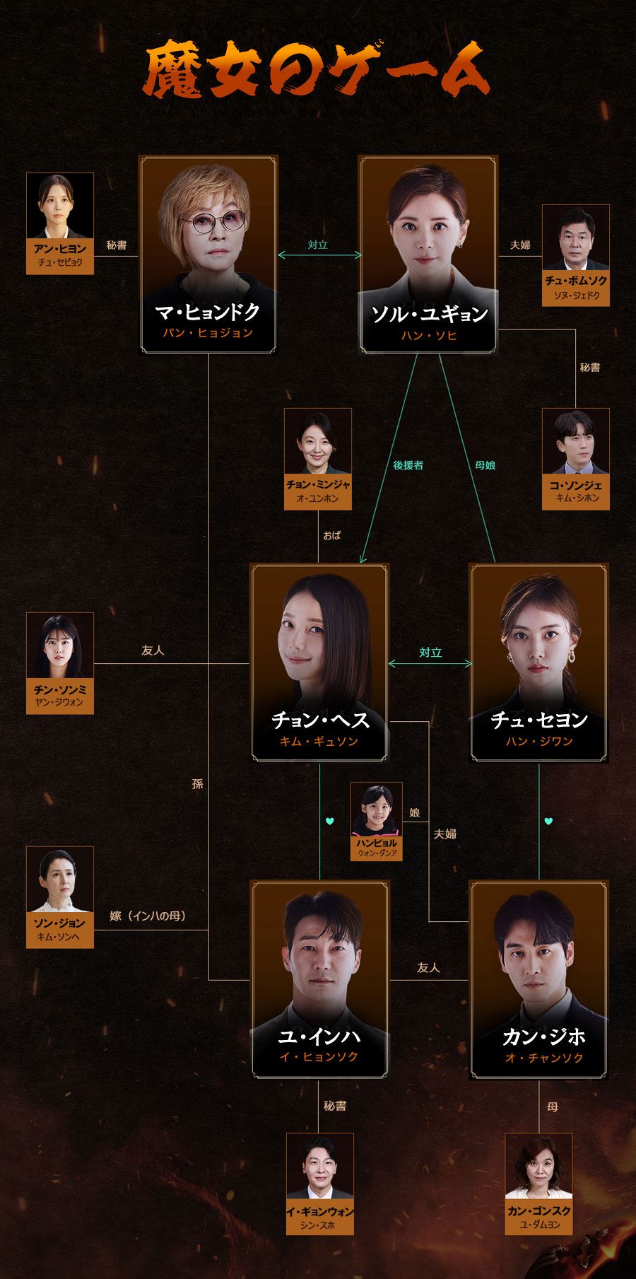
[jin_icon_account size=”25px” color=”#ffc0cb”]魔女のゲーム 相関図
【韓流】見るならU-NEXT!31日間無料トライアルができます☆
魔女のゲーム キャスト
[jin_icon_heart size=”25px” color=”#ffc0cb”]<役名>ソル・ユギョン(俳優名)チャン・ソヒ

チョナグループに勤める務取締役、代表取締
<その他の出演作品>
- 復讐のカルテット
- 我が家のロマンス
- カッコウの巣
- 愛の選択~産婦人科の女医
- 妻の誘惑
- 恋するレシピ
など
[jin_icon_heart size=”25px” color=”#ffc0cb”]<役名>チョン・ヘス/チョン・ミソ(俳優名)キム・ギュソン

ハンビョルの母
[jin_icon_heart size=”25px” color=”#ffc0cb”]<役名>カン・ジホ(俳優名)オ・チャンソク

ヘスの事実婚の相手
ハンビョルの父
[jin_icon_heart size=”25px” color=”#ffc0cb”]<役名>ュ・セヨン/チャ・カンジュ(俳優名)ハン・ジワン

偽のチョン・ミソ
チョンハファッションのファッション事業本部デザイン室の室長
[jin_icon_heart size=”25px” color=”#ffc0cb”]<役名>マ・ヒョンドク(俳優名)パン・ヒョジョン

チョンハグループの会長
[jin_icon_heart size=”25px” color=”#ffc0cb”]<役名>ユ・インハ(俳優名)イ・ヒョンソク

ヘスが好き
カン・ジホの友
<その他の出演作品>
- おいしい人生
- ブッとび!ヨンエさんシーズン8
- ブッとび!ヨンエさんシーズン7
- 黄金の魚
- ブッとび!ヨンエさんシーズン6
[jin_icon_heart size=”25px” color=”#ffc0cb”]<役名>チュ・ボムソク(俳優名)ソヌ・ジェドク

ユギョンの夫
[jin_icon_heart size=”25px” color=”#ffc0cb”]<役名>(俳優名)
<その他の出演作品>
[jin_icon_heart size=”25px” color=”#ffc0cb”]<役名>アン・ヒヨン(俳優名)チュ・セビョク

ヒョンドクの秘書
<その他の出演作品>
- 甘辛オフィス
- THE K2
- マイ・リトル・ベイビー
[jin_icon_heart size=”25px” color=”#ffc0cb”]<役名>コ・ソンジェ(俳優名)キム・シホン

ユギョンの秘書
<その他の出演作品>
[jin_icon_heart size=”25px” color=”#ffc0cb”]<役名>チン・ソンミ(俳優名)ヤン・ジウォン

ヘスの友人
<その他の出演作品>
- 離婚弁護士は恋愛中
- WHAT’S UP(ワッツアップ)
その他のキャスト
- ソン・ジョン→(演)キム・ソンヘ
- イ・ギョンウォン→(演)シン・スホ
- カン・ゴンスク→(演)ユ・ダムヨン
など


コメント
Across experimental ecommerce testing and sandbox UI reviews, reviewers encountered an embedded navigation block containing drift market willow showcase within page flow – the missing willow visual theme makes the interface feel incomplete and lacking cohesive environmental design elements throughout
While going through different niche listing platforms and discovery hubs, I came across something that felt structured and minimal, especially where Ivory ridge access link appeared – Browsing here feels smooth, with nothing complicated or hard to understand, which makes it easy to move through content quickly.
In the middle of checking multiple platforms, I discovered visit this platform and liked how everything is organized here, making it easy to understand the structure and quickly find what I was looking for.
As I explored modern fast websites, I encountered view smooth web interface – Everything loads quickly and works smoothly, and the clean interface ensures a simple and comfortable browsing experience throughout.
Frequent visitors note that streamlined shopping portals often enhance product research, and they appreciate how the section linked via Floraridge Product Gateway – The interface is said to support faster decision making by grouping items logically and making comparisons easier for shoppers across categories while improving navigation flow significantly
People who appreciate structured trading systems often browse sites like Harbor River Finance Trade Hub where information is presented in a simple layout – The interface ensures users can follow data easily, making the platform feel clear and efficient.
As I continued browsing various niche listings and online recommendation pages, I came across something that seemed quite dependable and simple in structure, particularly references including this reliable browsing page – it feels easy to trust and navigate, so I’ll likely return later for a closer look.
Самостоятельные попытки обычно идут по двум типичным маршрутам. Первый — «пить понемногу, чтобы не трясло». На практике это продлевает запой и усиливает истощение: сон остаётся поверхностным, тревога нарастает, давление и пульс становятся нестабильными, организм не успевает восстанавливаться. Второй маршрут — резко прекратить и «перетерпеть». Тогда симптомы отмены могут нарастать резко: паника, сильный тремор, потливость, тахикардия, скачки давления, тошнота, рвота, бессонница. Испугавшись ухудшения, человек снова возвращается к алкоголю, потому что это кажется единственным быстрым способом облегчить состояние.
Углубиться в тему – [url=https://vyvod-iz-zapoya-orekhovo-zuevo12.ru/]вывод из запоя на дому круглосуточно[/url]
While examining different e-commerce gallery concepts and vendor platform layouts for inspiration and usability comparison Pearl Cove curated market space the browsing flow felt structured and steady allowing me to explore content without any unnecessary distractions or complexity. – Everything loaded quickly and the interface remained organized which improved the overall experience
During a focused session reviewing online marketplace frameworks and vendor showcase layouts for UX reference and performance observation across multiple demos Dune Meadow digital vendor space the structure felt logical and navigation remained predictable across sections – Fast loading performance with clear layout structure and minimal distractions during browsing
During frontend evaluations of ecommerce gallery prototypes, UX researchers highlighted a segment where dune market visual gallery module link the same layout pattern repeats across multiple pages, reinforcing concerns that the system relies heavily on AI generated template spam rather than unique design composition overall system
Наркологический стационар в Санкт-Петербурге: помощь при зависимости, восстановление и круглосуточное наблюдение в наркологической клинике «Похмельная служба»
Изучить вопрос глубже – [url=https://narkologicheskij-staczionar-sankt-peterburg-2.ru/]наркологическая клиника стационар в санкт-петербурге[/url]
As I moved through various marketplace hubs and commerce vendor directories, I came across something that looked extremely familiar in structure and naming, particularly Harbor vendor alpine hall marketplace link – The repetition of branding made it feel like déjà vu all over again.
During a final comparison of vendor collective websites, I found see oak meadow collective marketplace hub – The product photos are clean and well presented, and the descriptions are helpful, making the entire browsing experience clear and reliable.
В Нижнем Новгороде стационарное лечение используется при наличии факторов, которые увеличивают риск осложнений или делают домашний формат недостаточным, особенно при алкоголизме или тяжёлом состоянии больного. Врач принимает решение на основе осмотра, консультации, анализа данных и оценки симптомов и динамики состояния пациента. Основная цель — обеспечить безопасность человека и создать условия для контролируемого лечения алкоголизма.
Изучить вопрос глубже – [url=https://vyvod-iz-zapoya-v-staczionare-nizhnij-novgorod-1.ru/]вывод из запоя в стационаре клиника в нижнем новгороде[/url]
While examining frontend ecommerce prototypes and template driven shop builds testers encounter mid content navigation artifacts orchard goods hall console which visually integrates well with surrounding design but leads to sparse product pages lacking meaningful browsing categories or expanded listings – The driftwood theme feels atmospheric yet the hall contains almost no substantial catalog content
While browsing through different niche discovery pages and resource platforms, I came across something that felt intuitive and modern, especially when seeing Ivory harbor vendor link included – It looks professional overall, and I might recommend this to others as well since the layout is easy to follow and visually clear.
электрокарнизы москва [url=https://prokarniz17.ru/]prokarniz17.ru[/url] .
wheatmeadowmarketroom.shop – Clean layout and simple navigation, makes exploring content really enjoyable.
1xbet giri? yapam?yorum [url=https://1xbet-67.com/]1xbet-67.com[/url] .
People who appreciate handmade creative platforms often browse sites like Ridge Fern Artisan Collective Market Hub where items are displayed in a structured and balanced format – The interface ensures browsing feels smooth, organized, and visually consistent for all artisan goods.
During usability analysis of ecommerce sandbox environments and UI prototype systems, testers identified mid page modules containing solar orchard market house vendor showcase access node within layout structure, and despite the eco inspired orchard solar naming suggesting trust and stability, the checkout page is missing security badges which weakens credibility during testing and evaluation processes
While analyzing sandbox ecommerce systems and vendor gallery templates, testers encountered a mid page component featuring cove plum goods gallery vendor portal link inside structured layout, and despite the expectation of a deep plum color palette, the interface renders almost entirely in gray tones which makes the visual experience feel flat during interaction testing and UI evaluation sessions
People using vendor listing systems typically expect structured navigation that allows them to quickly identify relevant services without distraction fern harbor listing center – This center provides an organized browsing flow that helps users locate vendors efficiently while maintaining a clean interface design
As I continued browsing through online suggestion lists and niche resources, I noticed something that seemed well functioning and smooth, particularly with this reliable browsing hub included – there were no issues at all, so I’ll probably come back later for a closer look.
While exploring different online options earlier today, I found browse this site which I checked earlier today, and everything looked neat and quite easy, making navigation simple and pleasant throughout.
сделать реферат [url=https://nejroset-dlya-referatov-24.ru/]сделать реферат[/url] .
During a general review of online marketplace hubs and vendor directories, I noticed something that felt calm and outdoors-inspired, particularly Cove market hall alpine commerce hub – It has a cozy mountain shop vibe that feels simple, warm, and easygoing.
While performing usability checks on experimental marketplace systems, reviewers found embedded references like goods room ridge market entry inside central layout sections, and despite the structured design, after the dash – ridge landscape themes look appealing but all footer links are broken and lead to empty or missing pages consistently
During my online browsing earlier today, I found review this link which appeared to be a nice little site, and I found it useful while browsing earlier today due to its clean layout and straightforward content flow.
During a casual browsing session across niche directories and discovery pages, I came across something that felt fast and accessible, particularly references like Isle icicle vendor hub – The platform feels nice, and I appreciate how quickly pages load, making everything simple and easy to navigate.
While reviewing sandbox ecommerce gallery systems and floral themed UI designs, testers encountered a mid page component featuring cove daisy market gallery entry node inside structured layout, and despite the clean aesthetic, the gallery page repeatedly generates a security alert which seems unusual and inconsistent during standard browsing sessions across multiple devices
People who enjoy well structured artisan stores often explore sites like Dock Oak Craft Artisan Outlet where items are shown in a clean layout – The interface creates a browsing experience that feels organized, easy, and visually comfortable.
While reviewing ecommerce vendor systems and UI staging environments, analysts encountered mid layout content featuring meadow solar vendor room market gateway access node embedded in structure, and despite the green energy inspired branding, the absence of eco certification markers makes sustainability unclear during usability testing and evaluation cycles
During an evaluation of online craft boutique platforms and their content presentation, I noticed visit velvet grove artisan boutique – There is a little typo in the description, but overall I’m satisfied with how smooth and organized everything feels.
карнизы с электроприводом купить [url=https://prokarniz17.ru/]prokarniz17.ru[/url] .
Online shoppers and researchers often rely on calm and well arranged vendor platforms that group products logically, making it easier to evaluate different listings and navigate through multiple categories with ease fern cove trade lounge entry – Vendor lounge feels calm with well structured product categories available, helping users enjoy a simple browsing flow while discovering vendors in a neatly organized digital environment
SARS down [url=https://south-africa-outage.online/]south-africa-outage.online[/url] .
As I explored different online directories and niche discovery lists, I found something that seemed well structured and clearly presented, particularly references like this tidy layout hub – the content is easy to digest and well arranged, so I’ll probably return again soon.
During frontend evaluations of ecommerce marketplace systems and UI gallery prototypes, developers observed navigation elements containing meadow mint gallery vendor goods console hub embedded in page flow, and although the mint meadow aesthetic is visually pleasing and refreshing, the lack of image variety in the gallery reduces engagement during usability testing and interaction analysis sessions
Across prototype reviews of ecommerce UI kits, observers noted that meadow goods entry panel sits awkwardly in the layout hierarchy, and despite the pleasant meadow theme SSL certificate warning popups reduce perceived reliability during user testing sessions across multiple builds
While going through niche marketplace listings and trade hall directories, I came across something that felt lighthearted in branding but underwhelming in selection, especially Acorn trade hall harbor commerce hub – The branding is fun and playful, but the inventory feels quite restricted at the moment.
one x bet [url=https://1xbet-67.com/]1xbet-67.com[/url] .
As I continued exploring various online resource hubs and marketplace listings, I came across something that felt organized and user-friendly, particularly with Harbor pine vendor access page – The experience is good, and everything seems clear and straightforward here, helping browsing feel natural and uncomplicated.
чат нейросеть для учебы [url=https://nejroset-dlya-referatov-24.ru/]чат нейросеть для учебы[/url] .
People who prefer neat ecommerce environments often explore sites like Harbor Lemon Artisan Commerce Outlet where products are displayed in a structured minimal format – The interface creates a browsing experience that feels bright, clean, and easy to explore.
During ecommerce UI review sessions and marketplace duplication checks, analysts observed a central module containing rain harbor vendor hall access node embedded within structured layout flow, and although the rain harbor branding feels atmospheric and consistent like repeated design systems, the vendor hall appears nearly identical to other domains which makes it feel like a copied template during usability testing across multiple environments
While reviewing intuitive commerce hub designs, I came across visit lemon structured hub – The layout is clean and logical, and browsing through content feels effortless and easy to follow.
Across sandbox UI testing and ecommerce marketplace reviews, analysts identified navigation elements containing glade market vendor harbor parlor showcase hub within page structure, and although the design feels airy and natural like a glade, the word choice strangely evokes air freshener associations even though the website itself performs normally during interaction testing and evaluation cycles
During research into modern retail district platforms, I explored explore this upland cove hub – The design is clean and minimal, and navigation feels comfortable, making browsing easy and straightforward for users.