

韓国ドラマ『血も涙もなく〜ディア・マイ・シスター〜』にでているキャストや相関図のご紹介★
血も涙もなく〜ディア・マイ・シスター〜登場人物の名前など気になったりすることもあるかと思います
どんなキャストが出ているのか、相関図、ストーリーなどご紹介していきます!
韓国ドラマ 血も涙もなく〜ディア・マイ・シスター〜のご紹介★

引用元:https://www.kbsworld.ne.jp/
予告動画
放送予定
- BS Japanext(BS10)
1月21日(火)ひる12:00
あらすじ
幼い頃、おそろいのイニシャル入りのペンダントを身に付け、ずっと一緒にいようと誓った姉ヘウォン(イ・ソヨン)と妹ヘジ(ハ・ヨンジュ)だったが、両親の離婚により2人は別々の道を歩むことに。父親についていくはずだったヘジは、別れる直前に放ったヘウォンのある一言で母親についていくことを決める。しかし育児を放棄した母親のせいで、散々な生活を送ることになったヘジは、いつしかヘウォンへの憎しみが膨らませるのだった。ヘジはペ・ドウンに改名し 、成功した人生を送るべくYJグループ会長イチョル(チョン・チャン)に近づく。無事に愛人の座を手に入れたドウンだったが、ある日イチョルの息子ジチャン(チャン・セヒョン)の婚約者に出会うことに。するとその婚約者がヘウォンとおそろいのペンダントをしていたのだった。ジチャンの婚約者が生き別れた姉のヘウォンだと分かったドウンは、自分の人生をめちゃくちゃにした原因であるヘウォンに対し復讐を始めることに…。

相関図
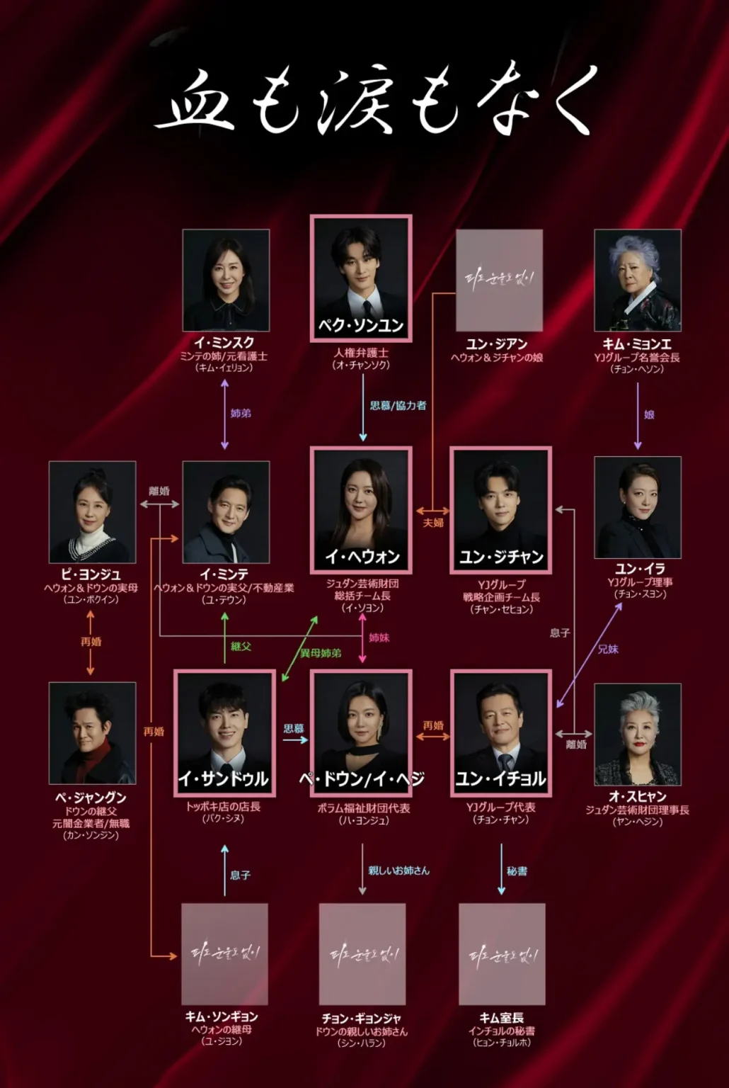
引用元:出典:ワウコリア
31日間無料トライアルができます☆
血も涙もなく キャスト
<役名>イ・ヘウォン(俳優名)イ・ソヨン

チュダン芸術財団の総括チーム長
<役名>イ・ヘジ/ペ・ドウン(俳優名)ハ・ヨンジュ

ヘウォンの実の妹
<役名>ペク・ソンユン(俳優名)オ・チャンソク

人権派弁護士
<役名>ユン・ジチャン(俳優名)チャン・セヒョン

YJグループの海外開発チーム長
<役名>ユン・イチョル(俳優名)チョン・チャン

YJグループの会長
ジチャンの父親
<役名>イ・サンドゥル(俳優名)パク・シヌ

ヘウォンの義理
ジチャンの友人
<役名>オ・スヒャン(俳優名) ヤン・ヘジン

イチョルの元妻
ジュダン芸術財団理事長
<役名>キム・ミョンエ(俳優名)チョン・ヘソン

ジチャンの祖母
イチョルの母
YJグループ名誉会長
<役名> ユン・イラ(俳優名)チョン・スヨン

イチョルの妹
YJグループ理事
<役名>ピ・ヨンジュ(俳優名)ユン・ボギン

<役名>ペ・ジャングン(俳優名)カン・ソンジン

その他のキャスト
- イ・ミンテ→(演)ユ・テウン
- イ・ミンスク→(演)キム・イェリョン
- キム・ソンギョン→(演) ユ・ジヨン


コメント
During frontend inspection of ecommerce sandbox platforms and vendor directory UI systems, developers identified a central module featuring harbor stone vendor hall construction entry portal integrated into structured layout, and despite the solid stone inspired theme, the vendor hall is not finished and still under construction which limits usability during testing sessions and evaluation stages
During casual browsing of online vendor systems I came across a mid page section containing crown cove commerce room hub and even though the branding feels regal and attractive, the blurry visuals in product listings reduce usability and make the shopping experience less effective for detail oriented users.
During a detailed review of online craft exchange websites focused on product variety and stock consistency, I noticed visit pebble creek craft hub – I plan to order again next month since I really hope they restock the items I missed.
As digital artisan markets continue to grow, many users discover platforms that emphasize creativity and one such destination is creative artisan listing portal where handcrafted goods are organized in an appealing way and browsing feels intuitive while exploring different artistic styles and maker collections. – A modern craft marketplace designed to inspire discovery and appreciation of handmade artistry.
While analyzing sandbox ecommerce marketplaces and UI vendor directory systems, testers identified embedded sections containing plum harbor room vendor showcase entry node integrated into page hierarchy, and although the plum harbor concept feels vibrant and natural, the vendor room shows zero vendors listed which impacts user trust during interaction testing cycles
While scanning through online marketplace directories and niche vendor hubs, I noticed something that stood out for its structure but lacked visual intensity, especially when seeing Violet brook foundry commerce hub included – The violet design idea is strong, though purple accents would make the visuals far more engaging.
While going through multiple niche resource collections and discovery platforms, I found something that stood out for its structure and clarity, especially where Coral meadow vendor access page appeared – Pretty decent site in general, navigation works well without confusion, making it easy to understand and move through content.
While checking various online vendor marketplaces I discovered a platform featuring Oak Cove marketplace hall listing – The structure is straightforward and uncluttered, yet the missing search bar makes it difficult to locate products efficiently which is quite inconvenient.
As I browsed through several collections of suggested links and niche resources, I noticed something that seemed worth saving for later, especially with this useful page included – it appears relevant and easy to understand, so I’ll revisit it for a deeper review.
While analyzing sandbox marketplace UI systems and ecommerce directory prototypes, analysts identified embedded sections containing golden cove vendor parlor market console node integrated into page hierarchy, and although the branding remains cohesive and aesthetically pleasing, the repetition of golden themed naming suggests a templated pattern across systems during usability pattern recognition evaluation
While studying how sleek design improves user experience in retail websites, I came across visit this elegant shop – The interface feels cohesive, and navigation is smooth and visually satisfying.
During a review of online retail district systems, I found browse oak cove retail space – The website runs efficiently, and everything feels stable, smooth, and free of confusion during navigation.
During comparison of aesthetic focused retail platforms with gentle design principles and user friendly structure I noticed within the page flow Softbrook Trading Co appearing naturally in the browsing sequence – updated note the experience feels clean balanced and intuitive making product exploration straightforward and pleasant
In reviewing curated online marketplaces I came across a system that focuses on clean structure and intuitive browsing behavior Chestnut Harbor trading platform view which presents products in a visually appealing way while ensuring users can navigate categories smoothly and discover items without unnecessary complexity in the interface.
In the middle of browsing ecommerce listings I noticed a content block featuring creek harbor trade house network portal and while the layout is organized and easy to follow, the similarity to tradehall creates uncertainty about whether they are separate platforms or variations of the same system.
Online shoppers value marketplaces that offer structured vendor organization and clear browsing categories to enhance product discovery and usability Vendor Discovery Hall – The platform layout is thoughtfully arranged, allowing users to navigate efficiently between sections while keeping the browsing experience simple and intuitive
As I continued exploring niche marketplace hubs and online storefront listings, I found another platform that follows the same velvet branding approach, particularly Cove atelier commerce velvet portal – Yet another velvet domain showing up, reinforcing the pattern I keep encountering.
Across ecommerce sandbox UI evaluations and gallery marketplace prototypes, testers noticed navigation components containing golden trade harbor vendor gallery access hub embedded in page flow, and although the interface feels professionally designed, the gallery is empty of real images which reduces engagement during usability testing sessions and performance checks
During usability testing of ecommerce marketplace systems and UI sandbox environments, testers found a navigation module containing marble harbor gallery trade vendor access portal link embedded mid layout, and although the marble harbor branding feels sophisticated and clean, the gallery images are low resolution which disrupts user satisfaction during interaction testing and evaluation processes
Shoppers who value quick access to products often engage with sites like Harbor Merchant Fast Lane where the browsing system is designed to reduce delays and simplify navigation – The interface focuses on efficiency and clarity, allowing users to locate items rapidly while maintaining a clean and intuitive shopping experience overall.
During a general browsing session across niche resource hubs and listing directories, I found something that felt well structured and easy to use, particularly references including Meadow coral trade access – The site is pretty decent, and navigation works smoothly without confusion, so it’s easy to explore everything comfortably.
During exploration of online bargain hubs I came across Nightfall tradehouse shopping entry – I was interested at first due to the deals, but the checkout process didn’t feel secure enough to trust.
pebblecreekcraftexchange.shop – Will order again next month, hope they restock soon.
While exploring a variety of structured online storefronts and evaluating usability and design clarity, I came across explore gilded lakefront goods district – The overall structure feels clean and well organized, making browsing more enjoyable and easy to follow throughout the site.
As part of studying minimalistic and nature-inspired website layouts, I explored check forest gear shop – The interface is clean and relaxing, and browsing feels intuitive and user-friendly.
During my search for interesting and potentially valuable resources online, I found a mention that seemed somewhat promising, especially when I noticed this option here – it gives a good first impression, so I’ll likely come back to it later.
As I explored different online marketplace listings and curated commerce pages, I noticed something that felt creative in naming but weak in trust indicators, particularly with Brook vendor velvet foundry hub – The Foundry name is quite unique, though trust badges would help here to make the platform feel more secure.
Users exploring online craft stores often seek platforms that highlight handmade authenticity, clear layout design, and smooth browsing experience Handcrafted Nightfall Storefront with structured product categories and responsive interface performance for improved shopping satisfaction overall across devices – It ensures artisans can present their work effectively while reaching wider audiences
During my review of outdoor-focused e-commerce platforms, I studied how effectively they support user navigation, and in the middle of that exploration I came across ValeCove Field Gear Depot – updated note: the browsing structure is simple and practical, ensuring a smooth and consistent user experience while maintaining clarity in product presentation.
During usability testing of ecommerce marketplace systems and sandbox UI environments, testers found a navigation module containing zen harbor parlor vendor access portal link embedded mid layout, and although the zen branding feels peaceful and meditative, persistent popups disrupt the browsing experience which breaks user concentration during interaction testing and evaluation processes
In the middle of evaluating ecommerce marketplaces I noticed a content block featuring creek harbor trade listing hub and while the design is refreshing and visually consistent, the broken search function reduces efficiency and makes it harder to find specific products quickly and reliably.
In studying digital marketplace frameworks I noticed a user centered design approach where Harbor caramel marketplace guide platform Harbor caramel marketplace guide integrated into layout improves usability – Vendor hall provides stable navigation and organized categories making product discovery straightforward while ensuring consistent usability across different browsing sections today smoothly.
While reviewing staging ecommerce vendor systems and UI marketplace templates, analysts noticed a content block featuring ridge vendor amber parlor showcase console node integrated into layout flow, and despite the warm amber ridge concept suggesting a polished marketplace, the vendor parlor section feels like a placeholder element which weakens perceived completeness during usability testing sessions and design evaluations
As I analyzed several digital artisan marketplace websites for clarity and design quality, I found check upland cove handmade market – The layout feels clean and well structured, and I had no trouble locating items quickly during the browsing experience.
While going through various curated discovery pages and niche resource listings, I found something that felt easy to process and well arranged, especially where Harbor copper marketplace page appeared – I like how simple the layout is, since it makes everything feel easier to navigate and understand immediately.
During exploration of various vendor sites I came across Moon Harbor commerce vendor lounge hub – The design is smooth and thematic, but I wish there were more product images available to better judge what is actually being sold.
Shoppers who prefer organized artisan marketplaces often value platforms that simplify discovery and improve browsing efficiency when interacting with Chestnut Cove Crafted Goods Hub – the interface maintains a calm and structured flow, ensuring users can find what they need without effort – each product is displayed with clarity and balanced presentation.
While analyzing artisan-inspired online stores with a focus on presentation and usability, I explored browse creative trail outlet – The layout feels curated and visually consistent, making it easy to view products in an organized and appealing way.
rent a coworking space coworking space dubai
During a general exploration of niche commerce hubs and online listing directories, I found something that stood out for its elegant branding but limited content depth, particularly references including Cove Vale studio marketplace page – The Vale label feels classy and premium, but product descriptions are too short to give full understanding.
During UX evaluation of sandbox ecommerce systems and vendor marketplace prototypes, testers found embedded navigation containing rose vendor cove market parlor access node inside structured layout, and although the rose cove branding feels romantic and visually soothing, the parlor section consists of empty boxes which negatively impacts user experience during testing sessions
In the process of evaluating multiple agency websites, I found click to explore – The layout is tidy and visually appealing, giving users confidence in the professionalism and attention to detail presented across the site.
Hello my loved one! I want to say that this article is awesome, great written and come with almost all vital infos. I’d like to look extra posts like this .
Businesses evaluating digital marketplaces today often prioritize transparency and ease of use when selecting platforms for sustainable growth, especially when reviewing vendor systems like Vendor Trade Network – users appreciate how this vendor ecosystem simplifies product discovery while maintaining consistent checkout flow and providing sellers with a more organized management system overall
oakmeadowvendorcollective.shop – Really clean product photos, descriptions are helpful too.
During casual inspection of online trade hubs I found embedded in the central page content cotton meadow online market hall and even though the design feels light and pleasant, the frequent logout issues create interruptions that negatively impact the overall usability and browsing satisfaction for users.
Users who appreciate minimal cozy marketplace design often browse sites such as Market Meadow Ember Collection where content is structured clearly – The interface creates a browsing experience that feels organized, smooth, and welcoming.
While navigating through a mix of curated lists and random discoveries, I encountered a mention that seemed mildly interesting, especially where this site reference was included – it appears decent enough, so I might give it more attention when I have time.
During a detailed review of online artisan marketplaces with diverse offerings, I noticed visit this oak cove craft hub – The variety is impressive, and the browsing experience feels enjoyable, making it worth spending extra time exploring different products.
While researching digital commerce platforms I came across a neatly arranged page where the Caramel Cove vendor exchange page appears mid content, enhancing structural flow – The market hall looks engaging today with solid pricing options and a user experience that remains smooth, organized, and visually consistent across sections.