

韓国ドラマ『血も涙もなく〜ディア・マイ・シスター〜』にでているキャストや相関図のご紹介★
血も涙もなく〜ディア・マイ・シスター〜登場人物の名前など気になったりすることもあるかと思います
どんなキャストが出ているのか、相関図、ストーリーなどご紹介していきます!
韓国ドラマ 血も涙もなく〜ディア・マイ・シスター〜のご紹介★

引用元:https://www.kbsworld.ne.jp/
予告動画
放送予定
- BS Japanext(BS10)
1月21日(火)ひる12:00
あらすじ
幼い頃、おそろいのイニシャル入りのペンダントを身に付け、ずっと一緒にいようと誓った姉ヘウォン(イ・ソヨン)と妹ヘジ(ハ・ヨンジュ)だったが、両親の離婚により2人は別々の道を歩むことに。父親についていくはずだったヘジは、別れる直前に放ったヘウォンのある一言で母親についていくことを決める。しかし育児を放棄した母親のせいで、散々な生活を送ることになったヘジは、いつしかヘウォンへの憎しみが膨らませるのだった。ヘジはペ・ドウンに改名し 、成功した人生を送るべくYJグループ会長イチョル(チョン・チャン)に近づく。無事に愛人の座を手に入れたドウンだったが、ある日イチョルの息子ジチャン(チャン・セヒョン)の婚約者に出会うことに。するとその婚約者がヘウォンとおそろいのペンダントをしていたのだった。ジチャンの婚約者が生き別れた姉のヘウォンだと分かったドウンは、自分の人生をめちゃくちゃにした原因であるヘウォンに対し復讐を始めることに…。

相関図
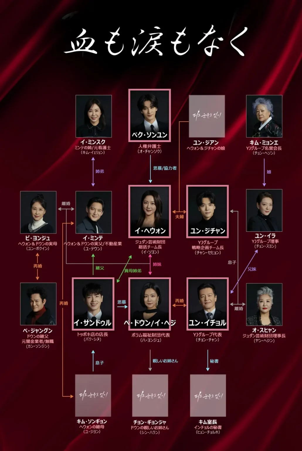
引用元:出典:ワウコリア
31日間無料トライアルができます☆
血も涙もなく キャスト
<役名>イ・ヘウォン(俳優名)イ・ソヨン

チュダン芸術財団の総括チーム長
<役名>イ・ヘジ/ペ・ドウン(俳優名)ハ・ヨンジュ

ヘウォンの実の妹
<役名>ペク・ソンユン(俳優名)オ・チャンソク

人権派弁護士
<役名>ユン・ジチャン(俳優名)チャン・セヒョン

YJグループの海外開発チーム長
<役名>ユン・イチョル(俳優名)チョン・チャン

YJグループの会長
ジチャンの父親
<役名>イ・サンドゥル(俳優名)パク・シヌ

ヘウォンの義理
ジチャンの友人
<役名>オ・スヒャン(俳優名) ヤン・ヘジン

イチョルの元妻
ジュダン芸術財団理事長
<役名>キム・ミョンエ(俳優名)チョン・ヘソン

ジチャンの祖母
イチョルの母
YJグループ名誉会長
<役名> ユン・イラ(俳優名)チョン・スヨン

イチョルの妹
YJグループ理事
<役名>ピ・ヨンジュ(俳優名)ユン・ボギン

<役名>ペ・ジャングン(俳優名)カン・ソンジン

その他のキャスト
- イ・ミンテ→(演)ユ・テウン
- イ・ミンスク→(演)キム・イェリョン
- キム・ソンギョン→(演) ユ・ジヨン


コメント
While comparing vendor platforms, those with clean interfaces and fast loading speeds often stand out the most Solar Meadow shop gateway this one provides a responsive experience where searching feels quick and effortless across all sections
While browsing through different niche discovery threads and resource collections, I came across something that felt simple and structured, especially when seeing Jewel cove marketplace hub included – Pretty clean interface overall, everything is arranged in a logical way, making the browsing experience feel easy and intuitive.
Across prototype UI systems and experimental marketplace frameworks, analysts encountered structured page elements featuring meadow dune commerce hall gateway inside navigation flow, yet the hybrid branding creates visual inconsistency that impacts perception – Meadow name contradicts dunes, making the storefront feel mismatched and poorly aligned with any single environmental theme during usability assessments and interface review sessions in testing environments
1xbet resmi sitesi [url=https://1xbet-69.com/]1xbet-69.com[/url] .
1 xbet giri? [url=https://1xbet-68.com/]1xbet-68.com[/url] .
sageharborgoodsgallery.shop – Looks clean and minimal, easy to find information without confusion.
1 x bet [url=https://1xbet-70.com/]1 x bet[/url] .
Across sandbox marketplace environments with repeated UI frameworks, developers identified a teal harbor themed layout that is visually appealing and consistent, but functionality is limited in the vendor area at a href=”https://tealharborvendorhall.shop/
” />teal harbor vendor hall marketplace node where the design remains polished and unified, yet the vendor hall content is still Lorem ipsum filler text which reduces credibility during system analysis and UX testing cycles
1 xbet giri? [url=https://1xbet-71.com/]1 xbet giri?[/url] .
People who prefer organized online emporiums often engage with sites like Grove Timber Supply Emporium where items are displayed in a structured layout – The interface ensures navigation feels smooth, simple, and easy to manage across categories.
When a site is a really nice platform, easy browsing and smooth user experience today become natural Calm Cove listing portal I appreciated the clarity across pages
People who prefer artistic shopping platforms often explore sites like Vendor Atelier Cove Teal Creative Hub where items are presented in a visually structured and expressive layout – The interface enhances browsing flow, making the experience feel engaging, artistic, and well organized throughout all product categories.
As I browsed different vendor commerce hubs and marketplace listings, I came across a newly launched platform that feels sparsely populated, particularly Cove Aurora room commerce goods hub – The structure is fine, but the minimal listings per category feel somewhat unusual.
During exploration of vendor gallery systems and online marketplace structures for usability research and design inspiration across multiple examples, I found Plum Cove goodsroom catalog entry embedded in structured content – The layout feels very readable and straightforward, allowing smooth browsing through sections while keeping everything clear and easy to follow from start to finish.
During a casual exploration of curated online listings and resource pages, I noticed something that seemed promising right away, particularly references like this vendor hub page – the overall setup looks well organized and thoughtfully built, so I’ll likely return soon for a more detailed review.
While exploring different vendor directories online, I found a platform that stood out for its clarity and structure during extended browsing sessions Canyon Harbor trade gallery hub the layout feels intuitive and makes navigating through categories smooth and consistently organized for users
While comparing vendor platforms, this one clearly stands out for its smooth browsing experience and well arranged structure overall Silk Meadow listings page I liked how everything was organized and simple to navigate from one section to another
While scanning through curated marketplace listings and online directories, I came across something that felt structured and minimal, especially where Jewel brook access link appeared – This seems useful overall, and I found the content quite straightforward today, making navigation feel quick and easy.
References:
Paddy power live casino
References:
https://casino-ab-18-oder-21.online-spielhallen.de/
During experimental UI evaluation sessions, testers spotted a navigation snippet containing dune drift market hall gateway placed within mid page content but suffers from sandy tone readability issues reducing clarity significantly in structured layouts – Dune aesthetic feels unified yet text contrast issues impact usability across devices
Frequent online shoppers suggest that streamlined marketplace design plays a crucial role in helping them find relevant items quickly, especially when they access Forest Cove Marketplace Entry which is seen as supportive of efficient browsing and reduced search effort – many reviews highlight better product visibility and improved navigation flow.
calmcovevendorparlor.shop – Really nice platform, easy browsing and smooth user experience today
After going through several slow-loading websites, I came across see this resource and appreciated how smooth the experience was overall, since pages loaded quickly without any issues or interruptions during browsing.
Across prototype UI environments for modern marketplace systems, testers observed a calm teal themed interface that creates a pleasant browsing atmosphere, however categorization depth remains insufficient in modules such as a href=”https://tealcovemarkethall.shop/
” />teal cove marketplace hall showcase link where the teal cove styling feels polished and visually appealing, but the market hall structure needs more category segmentation to improve usability during interaction testing and system analysis reviews
People who enjoy handcrafted warm design marketplaces often engage with sites like Brook Flint Artisan Retreat House Hub where items are displayed in a cozy structured layout – The interface creates a calm browsing experience that feels inviting, organized, and easy to navigate.
solarorchardartisanemporium.shop – Great for gift shopping, everything arrived in one piece.
While exploring various online tools, I discovered look into this and found its simple layout made browsing feel really smooth, with everything easy to access and clearly organized throughout the site.
During a general exploration of vendor lounge marketplaces and commerce platforms, I noticed a strong amber color identity, particularly Ridge amber commerce vendor lounge link – The visual style is appealing, but reading becomes uncomfortable due to weak contrast.
While reviewing curated marketplace designs and digital vendor showcase pages for inspiration and interface structure evaluation across different samples Dune Meadow shop portal access the system responded quickly and maintained clarity throughout navigation – Smooth loading experience with organized sections and stable interface performance overall
While comparing vendor galleries, platforms with clear organization and logical navigation tend to perform better overall Canyon Harbor vendor center the browsing process here is smooth and helps users locate relevant listings without unnecessary complexity
In usability analysis of ecommerce templates and demo storefronts, observers identified a navigation strip containing driftwood willow hub entry embedded within content flow – the site gives a half finished impression as willow tree visuals are not implemented and several sections appear visually empty or underdeveloped
While browsing through different niche discovery threads and online listings, I came across something that felt clean and user-friendly, especially when seeing Ivory ridge trade hub included – Browsing here feels smooth overall, with nothing complicated or hard to understand, which makes navigation feel quick and simple.
While testing UI prototypes and ecommerce sandbox systems, reviewers encountered embedded modules containing apricot harbor marketplace vendor hub within structured layout, and although the design is consistent, apricot harbor shows up again as the final entry for today giving a decent enough but slightly repetitive browsing finish
As I browsed fast and minimal websites, I came across view quick performance page – The interface is clean and simple, with fast loading times and smooth operation that creates a very pleasant browsing experience.
While going through multiple online directories and curated suggestions, I found something that seemed easy to navigate and quite stable, especially where this clean navigation hub appeared – the structure feels simple and reliable, so I may come back later for deeper review.
Many online shoppers describe that browsing digital marketplaces becomes simpler when filtering tools are clear, especially when they reach Vendor Room Explorer – Users find the browsing journey smoother because the layout improves visibility of products and reduces time spent searching through unrelated listings while making selection faster and more efficient overall
While exploring various online options, I found browse this site which gave a good impression because everything is organized here, allowing users to understand the content easily without feeling lost or overwhelmed.
People who enjoy organized financial dashboards often explore sites like Harbor River Trading Data Hub where information is displayed in a minimal layout – The interface ensures clarity, allowing users to move through sections with ease and confidence.
During an extended look into niche vendor directories and online gallery style marketplaces for structural evaluation and curiosity Pearl Cove vendor gallery entry the interface provided a calm and organized feel that made it easy to move through categories naturally. – Pages loaded at a steady pace and the design stayed minimal which improved overall clarity
During a detailed review of online vendor collective websites focused on product clarity and presentation, I noticed visit oak meadow collective hub – The product photos are clean and sharp, and the descriptions provide useful details that make decision making easier.
While checking experimental trade platform designs and marketplace gallery structures for inspiration and comparative analysis across several test environments Dune Meadow commerce showcase pages loaded efficiently and interaction felt smooth without confusion – Consistent responsiveness with clean presentation and well organized content flow overall experience
During a casual review of multiple commerce directories and vendor marketplaces, I stumbled across very similar naming styles that felt oddly repetitive, particularly Harbor Alpine vendor hall link – I had a strong sense of déjà vu, like I had already seen this exact store structure somewhere else.
During sandbox marketplace UI reviews, analysts repeatedly observed patterns where coastal dune gallery vendor market node interface modules are duplicated with minimal variation, suggesting AI template spam rather than curated design logic which testers noted during extended evaluation across multiple environments overall system design checks phase
In experimental marketplace evaluations testers frequently report navigation inconsistencies in template based storefronts orchard vendor showcase route that appears to connect to full vendor sections but instead loads a reduced interface with only basic product listings – The drift inspired design is smooth but content availability remains very limited
While going through different niche listing platforms and curated discovery hubs, I came across something that felt clean and reliable, especially when seeing Ivory harbor marketplace entry included – Looks professional overall, and I might recommend this to others as well since everything is presented in a clear and structured way.
wheatmeadowmarketroom.shop – Clean layout and simple navigation, makes exploring content really enjoyable.
Users who prefer curated handmade marketplaces often explore sites such as Fern Ridge Artisan Bazaar Hub where products are displayed in a clean and structured format – The design ensures browsing feels easy, pleasant, and visually consistent across all artisan categories.
While evaluating sandbox ecommerce systems and UI vendor prototypes, testers encountered a mid page component featuring orchard solar market house console hub link inside structured layout, and despite the solar orchard naming implying growth, freshness, and eco aligned commerce, the checkout page does not display standard security trust badges which weakens perceived transaction safety during UX evaluation sessions and interaction testing
Users who engage with vendor discovery platforms frequently look for intuitive layouts that reduce effort while improving clarity across multiple product categories vendor lounge hub access – This system emphasizes smooth navigation and clear categorization, allowing visitors to evaluate listings with minimal friction and improved understanding
As I explored different online resources and curated lists, I noticed something that seemed smooth and consistent in performance, particularly with this stable browsing page included – there were no problems during use, so I’ll probably come back later for further review.