

韓国ドラマ『血も涙もなく〜ディア・マイ・シスター〜』にでているキャストや相関図のご紹介★
血も涙もなく〜ディア・マイ・シスター〜登場人物の名前など気になったりすることもあるかと思います
どんなキャストが出ているのか、相関図、ストーリーなどご紹介していきます!
韓国ドラマ 血も涙もなく〜ディア・マイ・シスター〜のご紹介★

引用元:https://www.kbsworld.ne.jp/
予告動画
放送予定
- BS Japanext(BS10)
1月21日(火)ひる12:00
あらすじ
幼い頃、おそろいのイニシャル入りのペンダントを身に付け、ずっと一緒にいようと誓った姉ヘウォン(イ・ソヨン)と妹ヘジ(ハ・ヨンジュ)だったが、両親の離婚により2人は別々の道を歩むことに。父親についていくはずだったヘジは、別れる直前に放ったヘウォンのある一言で母親についていくことを決める。しかし育児を放棄した母親のせいで、散々な生活を送ることになったヘジは、いつしかヘウォンへの憎しみが膨らませるのだった。ヘジはペ・ドウンに改名し 、成功した人生を送るべくYJグループ会長イチョル(チョン・チャン)に近づく。無事に愛人の座を手に入れたドウンだったが、ある日イチョルの息子ジチャン(チャン・セヒョン)の婚約者に出会うことに。するとその婚約者がヘウォンとおそろいのペンダントをしていたのだった。ジチャンの婚約者が生き別れた姉のヘウォンだと分かったドウンは、自分の人生をめちゃくちゃにした原因であるヘウォンに対し復讐を始めることに…。

相関図
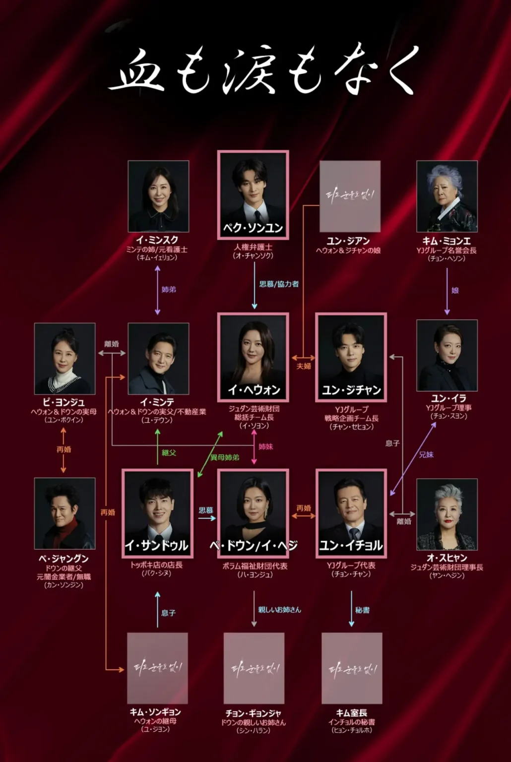
引用元:出典:ワウコリア
31日間無料トライアルができます☆
血も涙もなく キャスト
<役名>イ・ヘウォン(俳優名)イ・ソヨン

チュダン芸術財団の総括チーム長
<役名>イ・ヘジ/ペ・ドウン(俳優名)ハ・ヨンジュ

ヘウォンの実の妹
<役名>ペク・ソンユン(俳優名)オ・チャンソク

人権派弁護士
<役名>ユン・ジチャン(俳優名)チャン・セヒョン

YJグループの海外開発チーム長
<役名>ユン・イチョル(俳優名)チョン・チャン

YJグループの会長
ジチャンの父親
<役名>イ・サンドゥル(俳優名)パク・シヌ

ヘウォンの義理
ジチャンの友人
<役名>オ・スヒャン(俳優名) ヤン・ヘジン

イチョルの元妻
ジュダン芸術財団理事長
<役名>キム・ミョンエ(俳優名)チョン・ヘソン

ジチャンの祖母
イチョルの母
YJグループ名誉会長
<役名> ユン・イラ(俳優名)チョン・スヨン

イチョルの妹
YJグループ理事
<役名>ピ・ヨンジュ(俳優名)ユン・ボギン

<役名>ペ・ジャングン(俳優名)カン・ソンジン

その他のキャスト
- イ・ミンテ→(演)ユ・テウン
- イ・ミンスク→(演)キム・イェリョン
- キム・ソンギョン→(演) ユ・ジヨン


コメント
zencovegoodsgallery.shop – Simple interface clear structure makes finding information very quick indeed
Users exploring vendor listings typically value platforms that combine clarity with strong visual presentation for usability Forest Meadow listing hub the layout supports smooth navigation and helps users locate relevant content without delays
During my evaluation of user interface patterns, I encountered visit this destination – it strongly mirrors another platform I recently reviewed, creating a repetitive and somewhat unoriginal browsing experience.
While evaluating staging storefront systems and environmental ecommerce templates, testers found embedded content featuring elm goods exchange harbor panel within page hierarchy, but product images consistently fail to load resulting in broken visual elements across listings – Elm trees are strong, yet the goods room suffers from incomplete image delivery across the interface
mintorchardretailatelier.shop – Definitely coming back here for the holiday season.
During a general browsing session through niche directories and curated resources, I noticed something that stood out for its smooth usability, particularly references including this simple access hub – everything feels intuitive and easy to find with no confusion or complexity, so I’ll likely return again soon.
Clear structure combined with modern design improves usability, and this platform successfully provides both features Sky Harbor vendor navigator I found navigation simple and everything easy to locate without effort
Users who enjoy well organized ecommerce lanes often explore sites such as Lantern Orchard Unified Lane Hub where products are arranged in a clean minimal layout – The interface makes browsing feel smooth, engaging, and easy to follow across all sections.
In the middle of exploring different platforms, I discovered <view this page which delivered a clear and well-organized experience, allowing users to navigate easily and understand the content without effort.
As I browsed through various vendor marketplace listings and commerce hubs, I came across something that looks structured but strangely inactive, particularly Cove vendor Autumn room hub – The blog section being completely empty makes me question if the platform is still alive.
Users who prefer ocean inspired ecommerce environments often explore sites such as Wave Coastal Harbor Trading Outpost where products are arranged in a structured and soothing format – The interface creates a pleasant browsing flow that feels smooth, relaxing, and easy to navigate across all sections of the store.
While exploring curated examples of experimental websites, I came across a platform that strongly emphasizes non traditional layout and structure creative structure web project – The content feels experimental and thoughtfully arranged, making the design feel both unique and creatively intentional throughout
pineharbortradeparlor.shop – Nice interface design makes navigation simple fast and quite pleasant
Some websites feel cluttered, but this one has modern design and smooth interface making browsing feel very easy today Linen Cove quick browse page navigation felt intuitive and smooth
While examining various trade exhibition platforms and curated marketplace systems I found Birch Harbor product gallery view inside a reference section – everything felt responsive and stable, with smooth page transitions and a consistent layout that made exploration comfortable.
In the middle of browsing vendor directories, I encountered V “section access pointer” displayed in a broken format, and Cicicleislemarketparlor.shop was naturally embedded within the content, and overall design feels modern enough while navigation was quite simple to follow across pages.
During a casual browsing session across marketplace hubs and online resource collections, I found something that seemed structured and readable, particularly references like Cove moon trade page – The browsing experience feels solid, and I didn’t encounter anything confusing at all, which made everything feel simple and clear.
Online shoppers tend to favor websites that maintain organized layouts and clearly defined sections for better usability Violet Harbor market hub this ensures a consistent browsing experience where navigation feels simple and structured throughout use
While looking into digital vendor spaces for inspiration, I explored digital vendor lounge and appreciated the relaxed visual tone combined with clear category separation – It delivers a smooth browsing experience that feels both modern and easy to follow
While reviewing prototype ecommerce systems and support workflows, testers observed a contact panel containing harbor echo trade service hub integrated into UI structure, but outgoing customer service emails are not delivered and return bounce notifications – Echo harbor feels familiar and simple, however email backend reliability is broken and fails during all test attempts
In the middle of analyzing navigation usability, I noticed learn more here – the footer design implies active social engagement, but in reality, the links are inactive and fail to guide users anywhere meaningful or helpful.
Users who enjoy minimal yet strong marketplace systems often explore sites such as Granite Orchard Vault Line Hub where products are arranged in a structured layout – The interface creates a browsing experience that feels stable, organized, and easy to navigate across the platform.
While going through different online examples, I came acrossopen this modern site and noticed the design feels modern and neat, definitely stands out nicely with a structured and visually appealing layout that enhances usability.
Users who appreciate efficient ecommerce design often browse platforms such as Trail Harbor Commerce Grid Hub where products are arranged in a structured and user friendly layout – The design ensures navigation feels smooth, simple, and easy to follow across all sections of the store.
While browsing through various curated directories and niche resource collections, I came across something that felt quite easy to navigate and visually organized, especially where this vendor marketplace portal appears – I enjoyed exploring it because everything is neatly arranged and highly accessible, making the overall experience smooth and pleasant.
Digital marketplaces benefit from fast performance, and this site ensures pages load quickly and remain organized Silver Harbor item portal I enjoyed how smooth and responsive the entire browsing experience felt overall
bayharbortradehouse – Almost identical to another bay domain, bit confusing tbh.
violetharborretaillane.shop – They responded to my email within an hour, nice.
During my review of marketplace websites, this platform stood out because its smooth experience and clean layout make browsing very convenient overall today Plum Harbor browsing portal I found everything simple and very responsive
References:
Casino marketing
References:
https://20-euro-bonus-ohne-einzahlung-casino-deutschland.online-spielhallen.de/
During evaluation of vendor-focused online directories and shop systems, I found Honey Meadow trade network space integrated into a balanced interface that enhances readability and structure – The experience feels pleasant, steady, and easy to follow without unnecessary distractions
While browsing curated wine brand platforms, I found a polished and informative winery page that highlights premium icewine offerings effectively icewine heritage collection hub – The content is detailed and visually appealing, making the brand feel refined and professionally presented overall
During exploration of online vendor hub designs and trade gallery systems for UX evaluation and inspiration across sample platforms, I discovered Pebble Pine digital marketplace view placed in the content section – The platform was easy to navigate and I enjoyed browsing listings without confusion, with everything presented in a clear and structured manner.
While casually looking into creative vendor platform layouts and digital storefront ideas, I came across Moon Cove digital storefront – The site offered a relaxed browsing atmosphere, and I appreciated how smoothly the pages loaded while maintaining a consistent visual structure throughout overall browsing feel.
While going through different online directories and marketplace-style listings, I found something that seemed well organized and user-friendly, especially when seeing Mint market orchard link included – I like the overall feel here, because it’s simple and easy going, which helps the browsing feel natural and stress-free.
Users exploring online vendor directories often prefer platforms that keep navigation simple and visually appealing Icicle Brook shopping space the interface here supports a smooth browsing process that helps users move between sections easily and efficiently overall
During usability testing of ecommerce templates and cart functionality, reviewers noticed a structured element containing echo brook goods hall portal inside checkout pages, and although visually organized the cart system fails to recalculate quantities after changes – Echo brook is catchy and clean, but product quantity updates are broken or delayed in most testing environments
People who enjoy curated online vault systems often engage with sites like Cove Golden Elegant Vault Hub where items are presented in a clean refined format – The design ensures browsing feels consistent, visually balanced, and easy to follow across all sections.
While analyzing various online platforms, I discovered look into this which contained interesting content, and I spent some time checking different sections today while exploring its features.
People who enjoy organized online shopping environments often engage with platforms like Harbor Teal Commerce Goods Hub where items are displayed in a clean and logical format – The design emphasizes clarity and usability, ensuring categories are easy to explore and the browsing experience feels smooth and intuitive throughout.
When structure is clear, users can explore everything quickly, and this platform delivers that experience River Harbor listing portal navigation felt intuitive throughout
During my exploration of online commerce hubs and marketplace directories, I noticed a platform with a strong autumn aesthetic, particularly Meadow autumn vendor commerce hall link – The design is lovely, and adding verified reviews would make it even better.
While exploring structured online marketplaces, I spent time on Sun Cove merchant portal and found the design to be straightforward with a strong focus on usability – It feels calm, organized, and well optimized for easy browsing
As I continued browsing niche resource collections and online listings, I found something that seemed quite accessible, particularly with this clear trade hub link included – everything is explained in a simple way that makes understanding quick, so I’ll likely check it again soon for deeper insight.
This type of marketplace platform works best when simplicity is prioritized, and this one delivers a clean and easy layout Silver Cove browsing hub I enjoyed exploring different categories without feeling overwhelmed or confused at any point
Online shoppers commonly express that structured vendor rooms enhance their browsing experience significantly, particularly when they reach Forest Meadow Product Access Hub Central and they appreciate how categories are displayed in a straightforward manner – this setup is often praised for improving clarity and making decision-making faster during product comparisons across different sections
During exploration of experimental e-commerce platforms and curated marketplace systems for UX research and design evaluation across multiple references I discovered Teal Harbor trade parlor index – Navigation feels effortless and structured, with clearly defined sections that help users quickly locate information while maintaining a clean and distraction free browsing environment overall
While exploring digital storefront layouts and marketplace UX design, I discovered a section featuring Honey Meadow shopping parlor hub placed within a visually balanced grid that highlights simplicity – The browsing experience feels calm, intuitive, and pleasantly structured from start to finish
While browsing unique digital retail ideas, I discovered a conceptual supermarket platform that focuses heavily on simplicity and usability hope concept food hub – The layout is clean and straightforward, providing an easy browsing experience without unnecessary complexity or cluttered design elements
velvetgrovecraftboutique.shop – Little typo in description but overall I’m satisfied.